NØØT
Beyond the Ordinary Supplement Brand

Newcomer NØØT is rethinking what wellness can look and feel like — with bold branding and an image language that’s anything but ordinary.
We had the pleasure of crafting the full visual identity for NØØT, from the ground up. At NO Branding, we created a complete branding suite and a distinctive image language that reflects their innovative, curious spirit — and pushes creative boundaries at every turn.
Print design
Product design
Brand identity
Webstore Design


Shape meets Sharpness
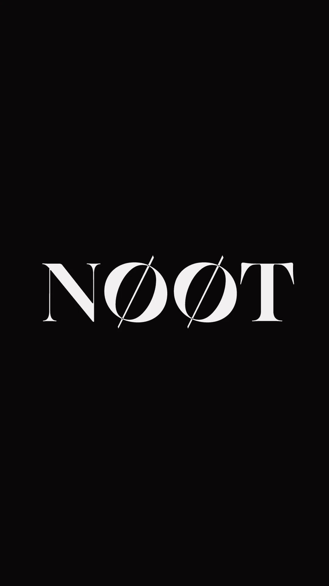
The logo is built on contrast — elegant yet subversive, poised but never passive.
We took the classic serif and gave it a jolt: the slashed Øs act as a visual disruptor, challenging convention with a sharp wink. It’s a mark that balances discipline with rebellion — echoing the brand’s no-nonsense approach to wellness and its unapologetically bold outlook.
Nothing ornamental. Nothing accidental. Just smart design with a twist.
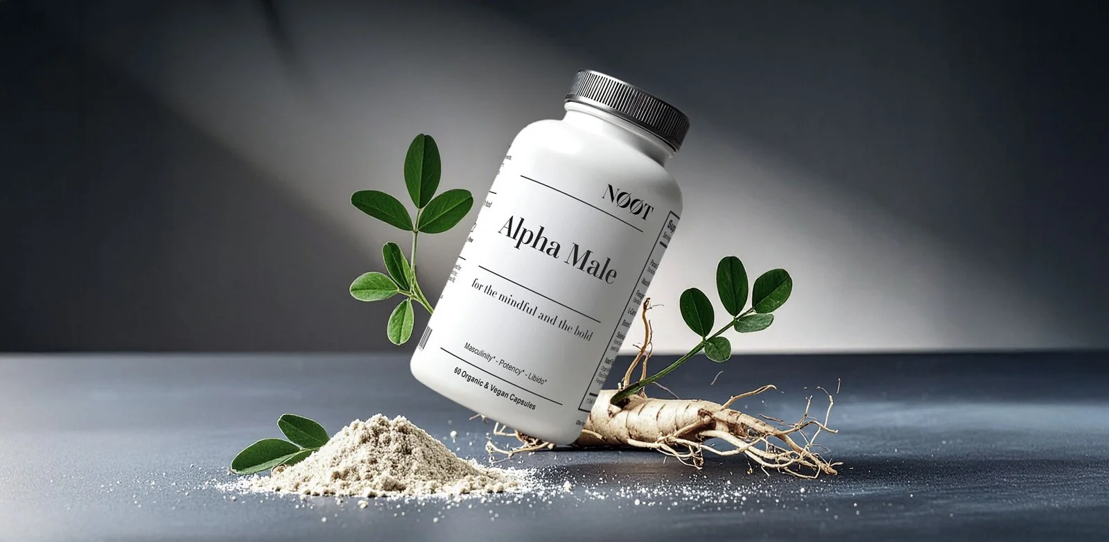

Grounded in calm clarity and quiet conviction.
The visual language we developed had each product framed with a sense of considered stillness — no noise, no clutter. Natural ingredients are artfully placed in soft, sculptural compositions that feel editorial rather than clinical. Shadows are intentional, light is diffused, and the palette stays minimal to let the product — and the promise — speak for itself.
It’s wellness, but redefined: precise, modern, and unapologetically serene.

